The Sandbox: Difference between revisions
mNo edit summary |
|||
| Line 31: | Line 31: | ||
==andthat's picture== | ==andthat's picture== | ||
hey guys .... i'm not sure how to include the picture that [[User:andthat|andthat]] contributed on the forum. it is good and i considered putting it where the b&w pic of the 3 of them is right now but i don't know how to get the size to work properly. or how to get the whole text box to be larger? it looks like this when i do it. does anyone have a suggestion or know how to tweak it? [[User:Steve is King|Steve is King]] 13:59, 25 July 2007 (EDT) | hey guys .... i'm not sure how to include the picture that [[User:andthat|andthat]] contributed on the forum. it is good and i considered putting it where the b&w pic of the 3 of them is right now but i don't know how to get the size to work properly. or how to get the whole text box to be larger? it looks like this when i do it. does anyone have a suggestion or know how to tweak it? [[User:Steve is King|Steve is King]] 13:59, 25 July 2007 (EDT) | ||
Images, when given "right" or "left" properties, are given the "float: right/left;" style, which basically cancels them from extending their container. To make a float stretch it's container, you have to add <div style="clear:both"></div> tags to each side. It's pretty complicated. :\ I have put in the tags, but there is a whole lot of whitespace now. I'll keep working on it and see if I can come up with something that looks nice. | |||
<div style="border:0; margin: 0.2em 10px 10px;"> | <div style="border:0; margin: 0.2em 10px 10px;"> | ||
| Line 37: | Line 39: | ||
<span style="color:#cf7606; font-family: Verdana, Arial, Helvetica, sans-serif; font-size:120%;">'''Welcome to''' </span><span style="color:#00000; font-family: Verdana, Arial, Helvetica, sans-serif; font-size:160%;">'''Pilkipedia'''</span> | <span style="color:#cf7606; font-family: Verdana, Arial, Helvetica, sans-serif; font-size:120%;">'''Welcome to''' </span><span style="color:#00000; font-family: Verdana, Arial, Helvetica, sans-serif; font-size:160%;">'''Pilkipedia'''</span> | ||
</div> | </div> | ||
<div style="background:#ffffff; padding:0.2em 0.4em 0.2em 0.4em;"> | <div style="clear:both;"></div> | ||
<div style="background:#ffffff; padding:0.2em 0.4em 0.2em 0.4em; float: left;"> | |||
[[Image:KPwithsign.jpg|right|170px]] | [[Image:KPwithsign.jpg|right|170px]] | ||
<span style="color:#00000; font-size:99%;"> | <span style="color:#00000; font-size:99%;"> | ||
| Line 49: | Line 52: | ||
</span> | </span> | ||
</div> | </div> | ||
<div style="clear:both;"></div> | |||
</div> | </div> | ||
</div> | </div> | ||
Revision as of 08:36, 30 July 2007
The Sandbox is a page where users can experiment with wiki editing. This page will be periodically wiped.
Duke33 Transcript Test
I was thinking of making some templates and re-doing the transcript pages, using the guys' images, rather than their initials. Maybe I'm just more of a visual person. Here's how the pages look today:
RG Well starting now, if I'd have said this at the end it might have been ambiguous, but I said it at the beginning, there's two hours thats a whole show, so there's two more shows.
SM Two more shows including this one
RG Yes well obviously
SM So only one more show after this one?
RG Its only five past one.
SM After this show one more.
And, here's my proposal. thoughts?
![]() Well starting now, if I'd have said this at the end it might have been ambiguous, but I said it at the beginning, there's two hours thats a whole show, so there's two more shows.
Well starting now, if I'd have said this at the end it might have been ambiguous, but I said it at the beginning, there's two hours thats a whole show, so there's two more shows.
![]() Two more shows including this one
Two more shows including this one
![]() Yes well obviously
Yes well obviously
![]() So only one more show after this one?
So only one more show after this one?
![]() Its only five past one.
Its only five past one.
![]() After this show one more.
After this show one more.
Chris's Opinion
I don't think its that good. It takes a little bit longer for me to work out who it is. But that might just be me being stupid. Good idea though.
Joe's Opinion
Interesting idea, but a bit distracting to look at - maybe need different images (same colour background? facing same way). Maybe we could have animated gifs for laughter?? JoeW
BTW
BTW, this is a great site!
andthat's picture
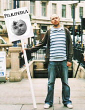
hey guys .... i'm not sure how to include the picture that andthat contributed on the forum. it is good and i considered putting it where the b&w pic of the 3 of them is right now but i don't know how to get the size to work properly. or how to get the whole text box to be larger? it looks like this when i do it. does anyone have a suggestion or know how to tweak it? Steve is King 13:59, 25 July 2007 (EDT)
Images, when given "right" or "left" properties, are given the "float: right/left;" style, which basically cancels them from extending their container. To make a float stretch it's container, you have to add
tags to each side. It's pretty complicated. :\ I have put in the tags, but there is a whole lot of whitespace now. I'll keep working on it and see if I can come up with something that looks nice.
Welcome to Pilkipedia

Pilkipedia is the only online encyclopaedia and community based around Karl Pilkington, Stephen Merchant and Ricky Gervais. The site includes in-depth articles on their radio work together on Xfm and The Ricky Gervais Show podcast, as well as content on their other projects such as The Office and Extras. In August 2006, Ricky Gervais declared Pilkipedia to be his favourite website in The Guardian.
| Forum | Shop |