The Sandbox: Difference between revisions
mNo edit summary |
mNo edit summary |
||
| Line 4: | Line 4: | ||
Okay, so due to issues with the various Steve Show pages (download, main page, and idivid. eps) I am going to try a radical approach to centralize them, but keep each page as well. | Okay, so due to issues with the various Steve Show pages (download, main page, and idivid. eps) I am going to try a radical approach to centralize them, but keep each page as well. | ||
This will be an ongoing project for me, and hopefully it will turn out well. | This will be an ongoing project for me, and hopefully it will turn out well. | ||
{{14_January_2007|Page}} | |||
==andthat's picture== | ==andthat's picture== | ||
Revision as of 05:18, 9 September 2007
The Sandbox is a page where users can experiment with wiki editing. This page will be periodically wiped.
The Steve Show Testing
Okay, so due to issues with the various Steve Show pages (download, main page, and idivid. eps) I am going to try a radical approach to centralize them, but keep each page as well. This will be an ongoing project for me, and hopefully it will turn out well.
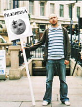
andthat's picture
hey guys .... i'm not sure how to include the picture that andthat contributed on the forum. it is good and i considered putting it where the b&w pic of the 3 of them is right now but i don't know how to get the size to work properly. or how to get the whole text box to be larger? it looks like this when i do it. does anyone have a suggestion or know how to tweak it? Steve is King 13:59, 25 July 2007 (EDT)
Images, when given "right" or "left" properties, are given the "float: right/left;" style, which basically cancels them from extending their container. To make a float stretch it's container, you have to add <div style="clear:both"></div> tags to each side. It's pretty complicated. :\ I have put in the tags, but there is a whole lot of whitespace now. I'll keep working on it and see if I can come up with something that looks nice. - Squeek
| Welcome to Pilkipedia |  |
|
Pilkipedia is the only online encyclopedia and community based around Karl Pilkington, Stephen Merchant and Ricky Gervais. The site includes in-depth articles on their radio work together on Xfm and The Ricky Gervais Show podcast, as well as content on their other projects such as The Office and Extras. In August 2006, Ricky Gervais declared Pilkipedia to be his favourite website in The Guardian. |
oh my. it hurts my head just to read that. BUT i need to learn, so thanks -- i will try to digest it. i guess it's not a good fit there but it's such a good pic that i'd love to use it somewhere. maybe between us all we can come up with a good spot or way to tweak things to fit it. or not. THANKS!! Steve is King 07:38, 30 July 2007 (EDT)
Alright, so I cleaned up the code and made the picture not stretch the box so much. It would be great to add some more text in there to fill up some more space, but for now it looks pretty decent. Tell me what you think. - Squeek
i love it. will see what mr. man thinks. Steve is King 16:17, 30 July 2007 (EDT)
Due to browser compatibility issues, I changed it to use a table instead of div's. Internet Explorer is super frustrating. - Squeek
It's a great picture but I don't think it works in that spot. It busts up the grey border and leaves too much white space on square monitors (even more white space if viewed on widescreen ones). Plus, the site's about Ricky and Steve too so I don't think it should be used in the site intro. But it's up to Steve is King, she's the Chief Editor. WikiSysop 20:20, 30 July 2007 (EDT)
he has spoken. it's settled then. maybe someone creative (ie, not me) can think of a more appropriate spot for it. chief editor bows graciously to site administrator. (but thanks for your efforts squeek! let's do think up another spot). Steve is King 20:31, 30 July 2007 (EDT)